Saturday, March 22, 2014

Antique Cocktail Napkins and Coasters!

Collecting antique textiles can be fun an practical.  There are so many items that don't involve wrestling 120" long pieces of linen.  In selling linens on Ebay, I found that a lot of people give antique linen as gifts.  It is something unusual as a hostess gift:  not too expensive, but something really fun for them to use and enjoy.

The one drawback is that you do have to iron them, but they are so much more elegant to use than paper napkins, and ironing only takes a few seconds, because they're usually about 4" x 6".  Antique coasters are great to use--don't necessarily have to iron after every use, unless it gets stained, and the lace ones often don't need ironing.

If you read my post on hankies, you know that I love Madeira embroidery.  Cocktail napkins can originate from many places.  They can be home-made, and have lace on them, but mostly they have fun figural designs.  I think roosters seem to be the most common, but many animals follow.

Cocktail Napkins
These cocktail napkins have an applique rooster on them.  Aren't they adorable!

These napkins are the most common to find.  However finding a large set is very unusual.

These Madeira napkins have the original metal tag on them.  Items with this tag indicate the highest quality embroidery from Madeira.
This rooster is very well done.  I love the red.
Aren't these works of art!  I love these figural napkins.
Wouldn't you love to get these as a hostess gift!
These appliqued animals are adorable.
I would like 3 dozen, please!

Can you see these in a summer party? On July 4, cherry red works for me!

These were cute in all the colors.   The little reticella bird is adorable.

These look like Marghab napkins, but they are a knockoff.  How can you tell?  The quality-the embroidery is great on the fish, but the edging is frayed.  That doesn't happen on Marghab.  However a scissor trim would solve this. 
These are handmade applique, aren't they cute!

Elegant Madeira grape embroidery.

These for sure should be a gift to an interior designer friend!

The napkins above are harder to find than luncheon napkins.  The sets below would make great gifts and work well as a hostess gift.  Think of a dozen tied up with vintage ribbon.

Fine Madeira embroidery.

Victorian eyelit embroidery

Fabulous set of a dozen cutwork napkins.

Cream Brussels lace edged napkins

Point de Venise lace with filet lace edge.


Really fun fringed napkins with great monogram

High quality fine monogram and embroidery

Fine yellow applique work.  
Coasters

Another plentiful option is coasters.  They go for a song on Ebay--and I can't believe how cheap they are.

Check out the wonderful quality--click on photo to enlarge.
These are Madeira, of course.

Fabulous lace coasters.

Madeira applique

It's always fun when you find the original box.  These are a nice simple design.

Awesome example of drawnwork.  Each square is a little different.
These wonderful Quimper coasters were  too cute to pass up.
Royal Society silk embroidery coasters are still fairly easy to find.
The more ornate the embroidery, the more expensive they are.
 These pink rose ones are killer!
Of course, the quality of Marghab embroidery done in Madeira is superb.
A stunning set of Marghab coasters like these would be an awesome gift.
Didn't see anything that caught your eye?  Think they're a bit too spendy for your budget?  Well, we have another idea:  Fingertip towels!  Below is a photo of a few Madeira and Marghab designs.


You can always find a set of fingertip towels for $2 to $4 each.  

I hope you enjoyed this walk through antique linen!   Wouldn't you love it if someone gave you a unique item like this as a hostess gift?  I would!

Friday, March 7, 2014

Antique Find! Pink Lusterware

My first piece of Pink Lusterware - a huge pint mug:


Collecting lusterware is extremely popular, as porcelain collecting goes.  One could only hope to achieve the collection below:

From Kay Elliot Collection
Kay has a good blog post on collecting Pink Lusterware.   Her ability to load a china cabinet is amazing.

Pink Lusterware became commercially available around 1790.   It has an iridescence caused by firing gold that turns pink.

I love the artistic handpainting on many of the pieces.
From Designs by Cleo
A saucer with a house on it.

When you see beautiful pitchers, they tend to be Sunderland:


Sunderland seems to have more colors on it.  I think the squiggly lines filling in the open space is charming. 

The pitcher below has the detail of transferware.

Or you could luck into a lot of pitchers at an auction:


Take a look at the piles of teacups in antique shops--you never know what you will find.

I've posted a photo that has the giant mug next to a standard 8 oz mug so you can see the size.

In the mean time, I think I will sit this on my desk.   It will hold alot of pens!

Tuesday, March 4, 2014

Antique Find! White Ironstone Scottish Hen-On-Nest

The antique show last weekend yielded several treasures.   Today I am sharing my favorite white ironstone find.   It is a Scottish Hen-On-Nest.


I know she will wind up in my new kitchen.   There is no connection in any of the pieces I purchased at the show, other than I do like things to be at least 100 years old, and I lean towards pottery.  Usually you see the Staffordshire pieces.   Sometimes you see some German pieces (tip:  those tend to be bisque)


This piece is marked John Thomson & Sons, Annfield, Glasgow, circa 1860-1880.

They also painted the hen-on-nest.   The Scottish Pottery society calls this one majolica.


I think I like my white better, at least today!  I need to find more white ironstone to keep mine company.

There's more.  I shared the platter already.
Stay tuned for more!

Sunday, March 2, 2014

Antique Find! - Delft Platter

Last weekend I got to go to an antique show in  Portland, Oregon.  I will share some of my finds as that is what you enjoy the most.

Who can resist blue and white porcelain or pottery?  Not many!   So many designers use it, and it's a great way to introduce some fascinating antique pieces into your room.  I saw this shape on this platter and knew I had to have it.


I hunted for a similar shape in the internet and found this piece that was in a Doyle Auction:

Of course I love the scenes on mine:

 I never pass up anything with sheep on it....


For some reason the photos look more navy, but the color is more true delft blue.

One of my favorite photos of a room using blue and white is below:


This is done by Nancy Morton, a house called Boca Grande


Notice how she mixes the blue and white up with other items.   I like that.  I can't wait to figure out where to put my new platter.


Wednesday, February 19, 2014

Antique Find! Louis XV Settee

I don't think I ever shared this find with you.  

I think the crewel fabric got me interested in it.  I walked by it before when it looked like this:

But then again, I never seem to be able to pass up anything in this color fabric.   I think they also refinished the frame to a darker walnut--much more eye pleasing.   Today was one of those days where I went hunting for antiques and came home empty handed.   Looking at this brought a smile to my face.
The really great price on this piece helped too!  It was under $300.

Monday, February 17, 2014

Bathroom Inspiration

In our move last month,  we packed everything.  Now that I am unpacking, I am sorting through everything. There were about 20 boxes from the library.  I decided to thin down the decorating books.  In doing so, I came across a Nina Campbell book.  I found the inspiration for my bathroom in it, so I thought I would share it with you.

This is the inspiraton:

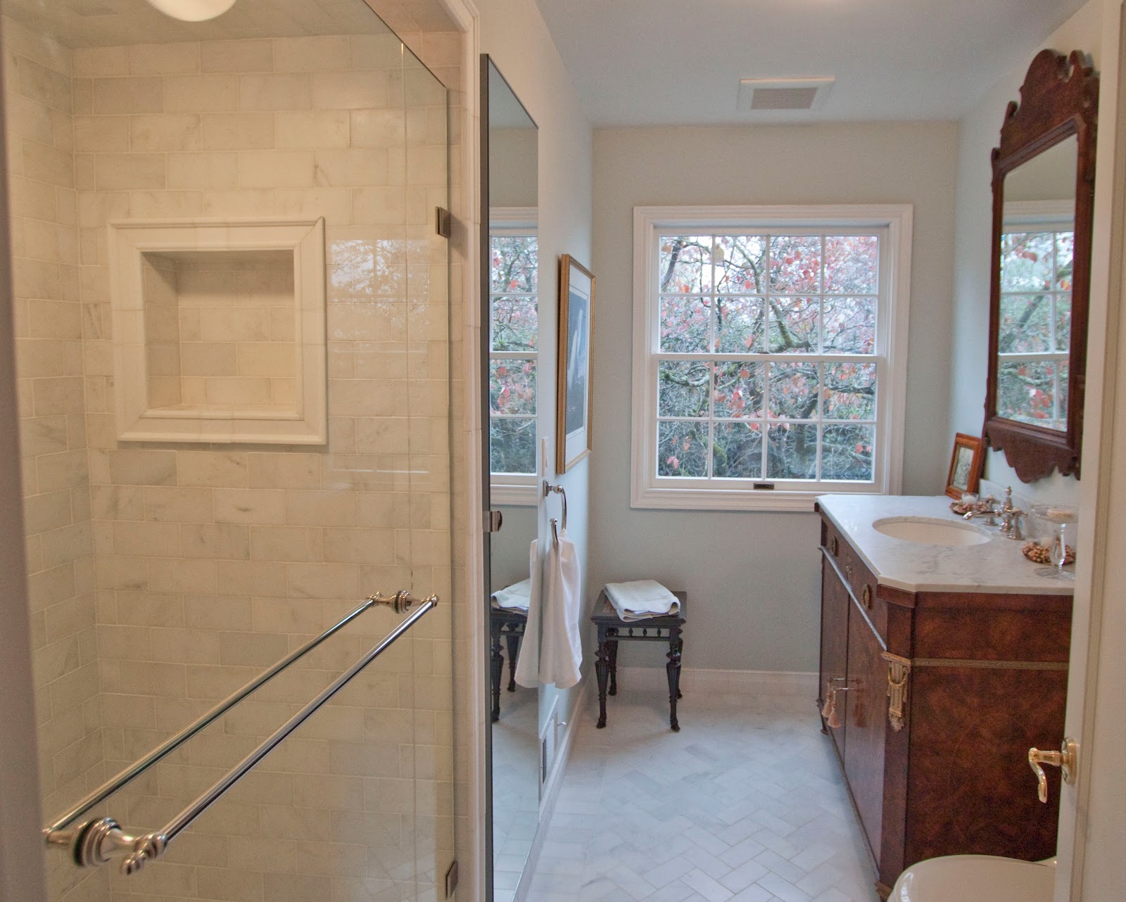
My version is below.  The  marble is Rojo Alacante with a white marble that I don't recall the name of.  I do know that crema marfil was to creamy.   The cabinets are curly maple.  You would have never guessed that!   I was lucky to get my carpenter to make it out of an exotic wood.  But then again, Papa usually does whatever I ask for!


 I love the veins in the marble.  The color is great...doesn't show alot of dust....

We had the slab fabricator make baseboard.
He also made a nice threshold for us, a beautiful transition into the bedroom.
   I always meant to paint the walls the seafoam green that is in the bedroom.  We wound up having someone come out and fix some plaster problems, and I never decided on the paint.  I finally realized the best color was the bedroom color.  It's a pale seafoam green.  It is called filmy green by Sherwin Williams.


OK, back to the bathroom.  Here you can see the color of the floor marble against the white fixture.

 The curly maple cabinets had raised panel door, with a tiny moulding inside the door.   I remember my dad hated the hinges. No me, love them.
 The shower had hand-thrown subway tiles, lots of body jets--very fun on a sore back.  Sore from laying tile, of course!

The floor was a honed marble mosaic.  I don't understand why people are so paranoid about using marble.  Have you ever been in a 100 year old hotel in Europe, where the marble is worn because so many people have walked on it?  Well I did whatever it took to keep the marble/grout white.  Yea, bleach it is.   I would seal it afterwards.  If I remembered.
Below you can see that I had a tile scene inset in the shower.

That remodel was in 2004.  Now I am looking for inspiration for my next bathroom.   I did this bathroom in the casita for my parents in 2011:


It has a Restoration Hardware vanity, with rusty iron sconces.  The shower walls are marble subway tile.  

Of course if I'm talking about bathrooms, I have to share my bathroom done in 1990:

 Here's one done in 2007 or so.


New Inspiration Needed - 2014

I have to do a bathroom in our new house.  It is being built by Toll Bros, a national builder, so I am somewhat limited as to what I can do.  For example, I have to use one company for cabinets.  They don't have inset doors.  Rats.  So I have to do a full overlay door to get the look.

I have saved photos from prior street of dreams houses that I liked.  The one below is from 2005.  I like to look back to see what looks dated, and what I still like.  What I liked about this room was that it had so many windows.   I don't like the giant built in tubs, but that's just me.  I don't think I like the split counter, but I do like a makeup counter with chair.  I like the ottoman.  it's perfect for me to throw my robe, and also use to get dressed.


I don't remember where I got the photo below, but I'm leaning towards the all-white bathroom right now.  I like the free-standing tub.  I have a discovered a few things-- they are outrageously expensive, in the $4000 range for a model like this.  You have to have the plumbing done for a center drain.   I can't use it because our house is on concrete slab which has some post-tension devices running through it, so I can't move the plumbing.  Just a warning.   It would work on a second floor.


I don't think I lie the black and white basketweave, too contrasty for me.  Ann Sacks has a great little blue dot I like better:

Last summer I went through the house below in Portland.  I really like the cabinets, but not sure how I feel about the cream colored marble.


I would like to do an inset floor pattern.  I would probably pick a herringbone pattern.
 I think I would add a pale grey pencil border to accent the inset, whatever I choose.


Models around town have cream marble.  This seems sooo boring. Help!


I checked Houzz to see what I could find:


Interesting how they went with cream colored cabinets and white marble.  Again, I'm seeing a lot of basket weave.

I've taken you down memory lane.  I think that while some of my choices in the past aren't as timeless as I'd hoped, I'm hoping that I will make the next house as nice as some of my previous choices.

So what are your thoughts?   Would you do a wood cabinet or painted cabinet?  Would you go white or cream on the floors/counters?  All decisions need to be made by the end of the month.