There are a few inspiration bathrooms that appeal to me. After going through houzz.com and looking at thousands of pictures, I am on overload. I think every designer in the world is using white marble subway tile and white painted cabinets.
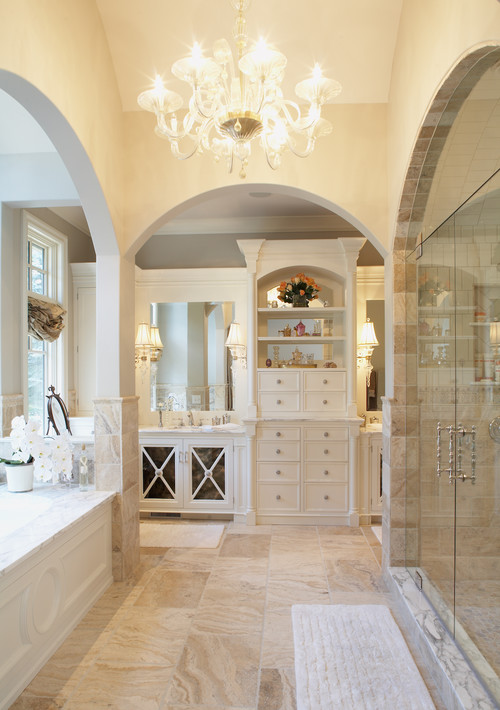
Here are some photos I've collected of bathrooms that I like. One thing I like about the bath below is the windows and the ottoman. I am thinking about the wall color and the use of cream on the tile and cabinets--the room seems very warm.
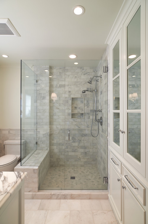
My husband, on the other hand, really likes the all-white marble bathrooms. I think it is because of the hotels he's stayed at in Europe. They're all ancient and marble ages beautifully. Of course I'm a bit harsh on white marble, I use bleach products in the shower, which doesn't really noticeably etch marble (in my book), but it does eventually destroy grout. I like to KNOW that my showers are germ free!
 |
| From Houzz.com |
There are many all white marble tile showers. I do love them all.
 |
| From Houzz.com |
The master bath is the shape below. I like the L-shaped vanity wall. While I am a big fan of symmetry, I am thinking of going with this design. It provides a ton of storage which is important to me. My bath measurements are 140" for the longer vanity wall, the shorter back wall is actually 86". The tub is on the right like the photo below, and there is a doorway in the center that goes to a very large closet that even has a window in it!

I had featured this bathroom in an earlier post "Shingle Style Meets Northwest" Sept 2013. The doors with the X's intrigue me. I'm not sure if I really like them or if I would get tired of them. They seem sort of french country so that appeals to me. The tower on the right with the two doors-- I would probably make that one door, and I am thinking about putting a mirror in it rather than glass. I know I like to stage with nice towels, or fancy antique smalls, but I would also do well with mirror. The mirror over the drawers would not be there, I really want to put a painting there to warm it up.
What do you think about the vanity? The one above is very narrow, about 25". I would do about 30". I am thinking of putting a medicine cabinet in behind the center mirror. I have to store my hairspray somewhere!
The vanity below was featured in Traditional Home. What do you think of the two towers instead of 1? My husband says he doesn't like the two sideways sconces, which I would have to do because of the electrical work already done. (moral of story: PICK OUT EVERYTHING before you build!)
There are many things I like about this vanity, I like the mirror with the rosettes in the background, I like the rounded doors, the Louis Philippe mirror, the very cool chair.... I could do this, but it would make the sink to the left of the vanity and bank of drawers to the right of the vanity smaller. I would do a bank of drawers on each side, rather than doors on the bottom. They would have to be about 11" wide.
Here is what most people do in the development:
In the mirror reflection you see a shower. I would like to build a wall between the tub and shower. I don't like cleaning glass! I think the vanity idea above is a huge improvement!
I did pick out some sconces:
The shades are more cream than white. Depending on the marble/tile selection, I may have to swap it out. Below is another bathroom where someone used them. OK, OK, I'm in love with the antique mirror. I don't own it and I should!
I have seen the bath below from Architectural Digest all over the internet. (Designed by Suzanne Kasler). I will take it, just like that! Wow. White marble, white cabinets and all.
Notice the sconces, familiar looking? (they are a different brand, over my budget) Of course the Venetian mirror is killer and really helps make the room, not to mention the architectural windows that are so fun.
I really like the antiqued mirrors on the back wall with the rosettes. I stopped by a glass shop, and they quoted me about $1300 for a 6' x 9' wall. I know there are alot of do-it-yourself antiqued glass out there, I don't want it to wind up looking like a house from 1967, with the only thing missing is the red flocked wallpaper on the other wall!
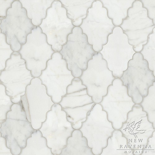
Tile shopping has really changed in the last 5 years. Of course we all want something a little different, so the market has responded with some really artsy designs with waterjet cut marble.
New Ravenna has tons of to die for patterns. I just don't think that $300/foot is something that most people would consider, but they are in lots of showrooms, someone is buying them! I am not sure what I will use. I am thinking about using the limestone that I have picked out for the rest of the house.
I have a second bathroom that I am designing around a bargain I picked up. This Restoration Hardware vanity:
 |
| Restoration Hardware St. James Vanity |
We are thinking about lining the walls with marble subway tile. I really like the idea of the antiqued mirror too--can't get it out of my head, and don't have a place to do it except here.
I have these sconces from Horchow that I may use in the room.
I have to get back to the cabinet guy on my design next week. I will be busy this weekend, as that includes the kitchen. I did find some lovely slabs of calacatta marble for the counter. I was looking for a honed finish, and this one has a finish called Satinato. Think of it as a slightly leathered surface. It is smooth, with some ripples at the veining. We really liked the finish on these particular slabs, as we've seen other leathered finishes that wind up being terrible on white marble, pitted, etc.
So leave me some comments with your opinions. I know thousands of you read my blog, so don't be shy, I know you're out there! I get so stressed out with all the expensive decisions that must be made, and picking things from swatches here and there, making sure it all goes together is quite a chore if you're not careful.


I really enjoyed this post and reading about your decision making process. Since I am in the midst of packing up our home and preparing for moving, I would vote for LESS storage as you may one day want to move again and have to pack all that STUFF in storage. Not exactly a helpful suggestion for you but it is on my mind through this process. I also love the antique mirror with the cherubs/angels on the frame - it is the high note in that bathroom, and makes the modern design come to life.
ReplyDeleteI agree-- I downsized by 1200 SF to this house. I am looking forward to less house to clean. I should have mentioned, the reason I want more storage in the bathroom is I want to declutter the bedroom and get rid of the triple dresser and highboy. Isn't that mirror wonderful! I can't wait to go on a hunt for antique mirrors in the bathroom. Thanks for sharing, and good luck with the move. I used 3 sizes of boxes from Home Depot and Uhaul. They stacked nicely in the moving truck and made moving day easy. Nothing broke!
ReplyDeleteI like the architectural digest antiqued mirrors with the gold mirror in front. I also like a similar ting inthe the traditional homes picture as above. I like the Suzanne kadlor grey cabinets as well, kind of different.
ReplyDeleteGreat, glad to hear it. Thanks!
DeletePs- to get more comments, turn off word verification for the comments section. You will get more comments!
ReplyDeleteOk I just did that!
Delete
ReplyDeleteThis blog perfectly highlights the importance of bathroom mirrors in home décor. They don’t just serve daily needs but also enhance the overall style of interiors. If you’re planning to buy premium-quality bathroom mirrors online, Vibecrafts is the best choice. Their collection includes elegant, modern, and decorative designs at affordable prices.
Nice post! bathroom mirroraren’t just functional—they elevate the entire look of your space. Vibecrafts has an amazing range of sleek, durable, and decorative bathroom mirrors perfect for both modern and classic interiors
ReplyDeleteI recently explored the bathroom mirror collection from VibeCrafts, and it’s absolutely amazing! Their mirrors add such elegance and brightness to any space. The designs are sleek, modern, and perfectly crafted to elevate your bathroom’s look. If you want style and quality in one, VibeCrafts is definitely worth checking out!
ReplyDeleteI recently came across VibeCrafts’ stunning Bathroom mirror , and they’re absolutely worth it! The designs are elegant, modern, and instantly elevate the look of any bathroom. The quality of the mirrors is exceptional — sturdy, clear, and stylish.
ReplyDelete