I purchased a really fun chair--an 18th century George III wingback with exaggerated wings. The curves of the wings, seen from any angle, really makes this a wonderful chair. So now my project is--what fabric do I select? I could use it in 3 different living/family rooms. Colors that would go are likely to be a neutral cream/tan, blue, or red.. The 3 rooms could be one that has a country french yellow toile drape in it, a family room with brown la declaration drapes, and a living room with a coral sofa, blue would be great in there.
Finding an old chair made me wonder what it may have been upholstered with originally. After hunting around, I found a reference Judith Miller made in one of her antique guides. She says that originally these chairs were upholstered in grospoint or petitpont needlepoint.
So I started my hunt for pictures of what a wingback chair from the 1700's would have looked like. There's a website called Furniturestyles.com that had this example. (See link below to read more)
This beauty is on Ist Dibs - (click on the link to view ad.). Interesting floral pattern. Sort of a Jacobean influence?
Another wonderful example with large bold flowers:
 |
George II Walnut Chair, circa 1730. Christies
More of those wonderful bold flowers.
|
I went to my favorite website for pictures, Liveauctioneers (yes I got permission, ok to use if I put in a link), and found this --and subsequently went to the Bonhams website. Again, a lovely floral needlepoint.
 |
| Fantastic chair from a Bonhams auction - photo Liveauctioneers.com |
So I checked out a few English antique websites and found more floral needlepoints. I'm assuming that the backs may be replaced?
 |
A 1750's chair with later 1800's needlepoint.
Notice the background color is different from the other examples.
Not liking that. At auction. |
 |
A GEORGE I WALNUT AND NEEDLEWORK-COVERED
WING ARMCHAIR CIRCA 1715 - ($62,500) Christies.
Hmm. An interesting departure from the other florals.
|
I thought that I'd check out what museums have, and found this at the Metropolitan Museum of Art. -- An American chair. I totally love this back. The front is interesting, a geometric patten. Date: 1758. I find that fascinating.
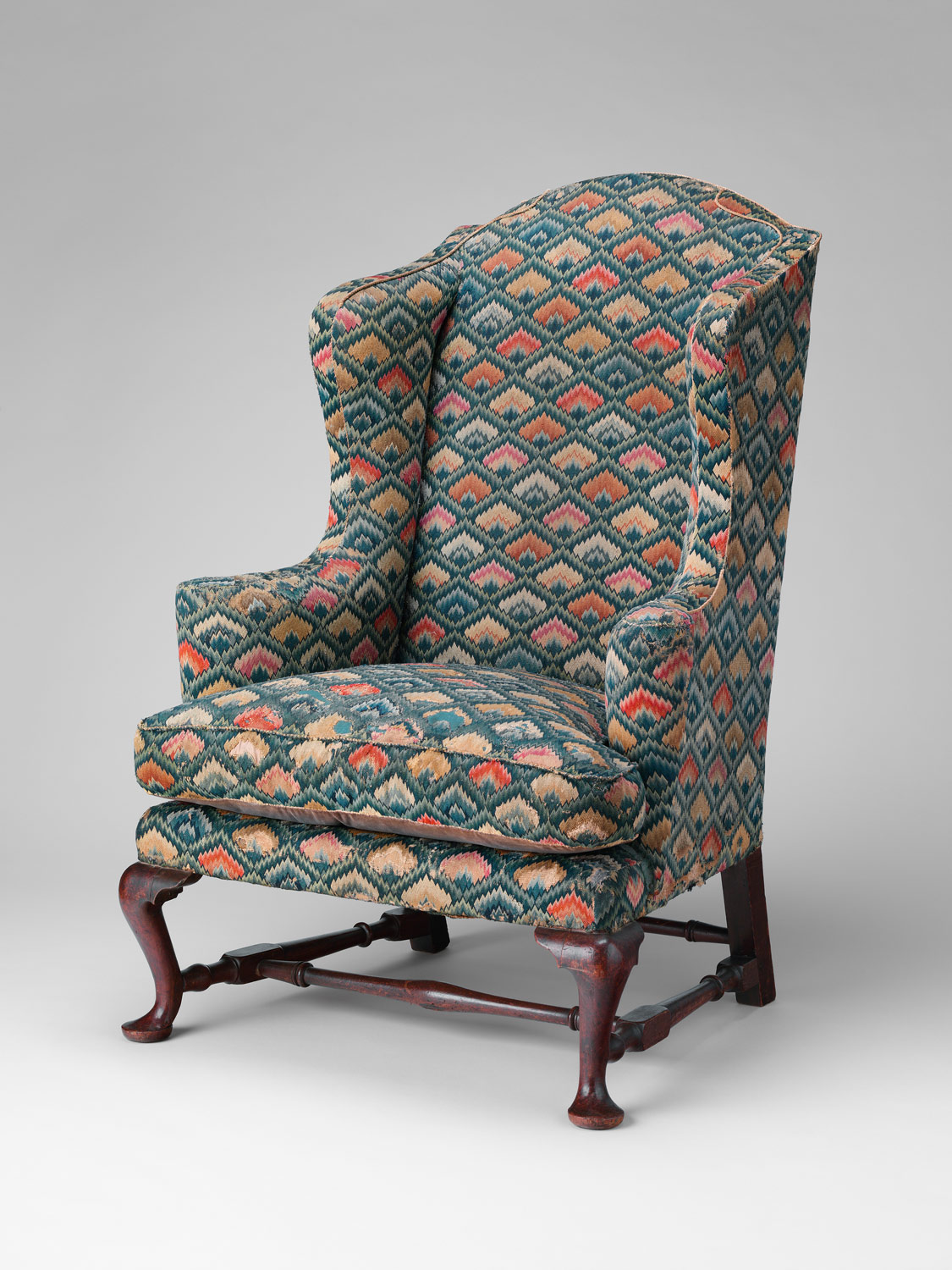 |
Fantastic needlepoint on the back of a chair, dated Newport 1758
at the Metropolitan Museum of Art. |
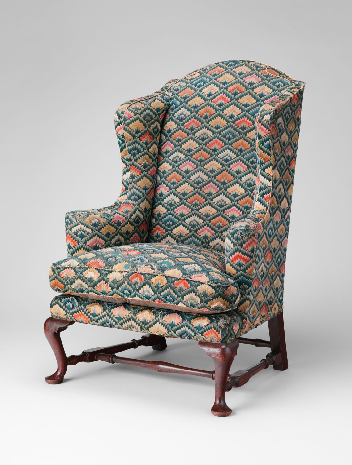 |
| Front of 1758 Chair at the Metropolitan Museum of Art |
The back reminds me of a needlepoint sofa-back - I'd just love having something like this. Don't you just love this.
Here's another to die for chair with a price tag equivalent to a few houses in Iowa:
From the Christies catalog:
A GEORGE I WALNUT WING ARMCHAIR
CIRCA 1720
With associated gros and petit point needlework, the back with a panel depicting a maiden by a well, surrounded by trailing foliage and flowers, the sides and back with plain cotton, on shell carved cabriole legs with pad feet and leather castors, some reworking to the needlework, the back seat-rail replaced, restorations to the ears of back legs
 |
| Check out the detailed stitching. |
Below:
A GEORGE I WALNUT WING ARMCHAIR
CIRCA 1720
Upholstered in associated 18th century close-nailed gros and petit-point floral needlework, the back and seat depicting classical figures, on cabriole legs with pad feet
Here's one in an upcoming auction. I have to say this is what I think most motifs are, although most of what you see is floral, I suspect that many I see in my price range (ok, not in my range, but ones I am able to see) may be later than 18th century.
A GEORGE II MAHOGANY WING ARMCHAIR
MID 18TH CENTURY
With associated 18th century figural needlework covering, the back legs later and oak...
ANYONE READING want to buy me a christmas present? !!
Judith Miller said most of the antique chairs would be figural or I assume she meant like these scenic. I do love the huge flowers. Given the age of these pieces, can you imagine how bright the chairs really were? If you think about the times, I'd like to sit by the fire, curtains pulled, dark rooms, most likely, to stay warm in the winter. A bright color would be needed, don't you think?
So now that I've seen all these fabulous examples, needlepoint that is only 100 years old just doesn't have the same look:
So how has the design community reacted to wonderful old needlepoints and tapestries? We get stuff like this. YUK in my book after seing so many wonderful antique pieces.
 |
| From Liveauctioneers. Don't do this fabric. |
There is another option: Crewel fabric. The chair below is probably the type of crewel that is available.
If you decide to go crewel, set the bar high. Using a colorful crewel is definitely the way to go. Often times the crewel is only used on the inside of the wing chair--I assume to save money as you can spend upwards of $500/yard for some of this stuff.
I spotted this on Ebay, one of my favorite dealers who carries textiles has this in her house: She is spot on, having found a wonderful tree-of -life crewel fabric. Don't you just love how the pattern fits on this chair? Wonderful! I would love to find something like this for my chair!
 |
| from a favorite eBay dealer: rivervalleytextiles. Click here to read her bio, and read about this project. (Check out her listings, she has the prettiest pictures. Plus she gives you great tips on care and collecting of textiles.) |
Chelsea textiles makes a dynamite option $510/yard wholesale.
OK, so I don't have any connections to get crewel on the cheap, haha. So what other fabrics are an option?
After checking out all those wonderful English chairs, I thought I should check out what you see on American chairs. I immediately thought of Colonial Homes, and how you saw two things: plaids or damasks. Talk about two extremes. Both are really strong statements, I think... Here are two plaid examples:
 |
This is actually more historically correct--most of the chairs did not have a cushion, and if it did,
it was a thin cushion. |
 |
| Another example of a blue plaid chair. |
 |
Probably more historically correct - no bottom cushion, according to other reading.
Then I read that they sat on plump pillows. HMMM, this is confusing. What do you think?. |
(FLAT CUSHION DIVERSION) Here's another chair with that flat cushion.
 |
This chair is interesting--it has the flat cushion. The photo is a bit blurry--
I can't really tell if it is a tapestry or chinoiserie fabric. Bonhams auction |
So I checked out alot of photos on historic wingbacks in the U.S. There are alot of beautiful chairs at Winterthur, the White House, and Blair House --it seems as though damask is what is used on these expensive chairs. I looked around on the internet, and found these beautiful chairs.
Isn't the chair above really awesome looking? I think the yellow fabric really looks the best, but I am pretty gutless when it comes to using yellow. Coral would work better for me than yellow.
The same website has all kinds of interesting wingbacks. I thought it would give me a good visual of what a pattern damask would look like.
 |
| Interesting channel back. I like the soft colors. Cut velvet is something that is actually "antique". |
Of course if I do cut velvet, only $500/yard (guess) Lee Jofa will do.
 |
| Le Notre from Lee Jofa |
But what if it winds up looking like grandma's velvet from the 60's? OK, back to damasks.
 |
Killer green chair. But how would it look in a room? I really love many shades of green,
but this one I think would whack me over the head when I walked into a room.
Ist Dibs |
 |
I actually love this bright chair. Great pattern. I think the damask pattern needs to dominate the back, don't you?
These chairs are so big, it needs a big pattern.
Ist Dibs |
I thought about blue. This one is too baby blue, I'm thinking an indigo blue. However, I am showing this one because I like the large cartouche on the chair back, works for me.
Or you could go conservative cream:
 |
A fabulous period chair. Very formal.
Ist Dibs |
Of course, my version would be less pricey than $30,000
OK, another rule, give up the arm covers. I have never liked them. No, I don't care if the chair gets dirty. The big problem with damask is that the "authentic" looking stuff is silk. I am way past doing chairs in silk, unless they're a little chair that I'm just going to look at, and never sit on. (had to qualify that)
For those who were looking for wingbacks, and got stuck reading my blog, I'll throw in some current chairs on the market, that aren't museum repros breaking the bank:
Hollyhock has this one:
I don't think I'm in a "busy pattern" mood. Could be fun in the right room.
Below is one from Anthropologie. It made me think, toile!
So of course I had to grab a Charles Faudree book and see what he likes.
 |
| Plaid -hmmm. Country French? or too early American? |
 |
| Pierre Frey Petit Parc fabric. A nice rich bold color. |
 |
Look no further than the front cover of Charles Faudree's book.
I think this is a Groves Bros fabric. I sent away for samples. |
I don't really like all toiles. I'm not really liking the chair below, I don't know why it seems flat to me.
 |
| apartmenttherapy.com |
Red or blue would work very well as an option for my chair. This pattern below is lovely, very Fortuny-like.
 |
| A nice large pattern works best on such a large chair--don't go for a wimpy cartouche! |
Not sure if I like the look..............
I do like this red pattern better.............
So what would you do. My chair is like the one above. I'm getting fabric samples. Stay tuned. Feel free to chime in on opinions. I'm just so paranoid after the 80's and people putting huge floral patterns on everything...but I don't want plain linen, don't want country check, don't think I want velvet, saving that for the moss green upholstery job on the sofa. I wish there was something out there that has the feel of the fabulous old needlepoints, but it doesn't seem to exist. I would love that!
What would you pick?


